
Airport Operations Advance Skills Scheduling Tool
United Airlines needed a clearer way to track whether their employees met critical training goals. I led the redesign of a dashboard used by airport operations managers to see how many employees are compliant with qualification training each day compared to daily targets based on schedules. The new design made this information faster to understand and act on.
Client
United Airlines
United Airlines
Platforms
PowerBI
PowerBI
Scope
Interaction Design, Information Architecture, Data Visualization, Visual Design
Interaction Design, Information Architecture, Data Visualization, Visual Design
Tools Used
Figma
Figma
Discovery
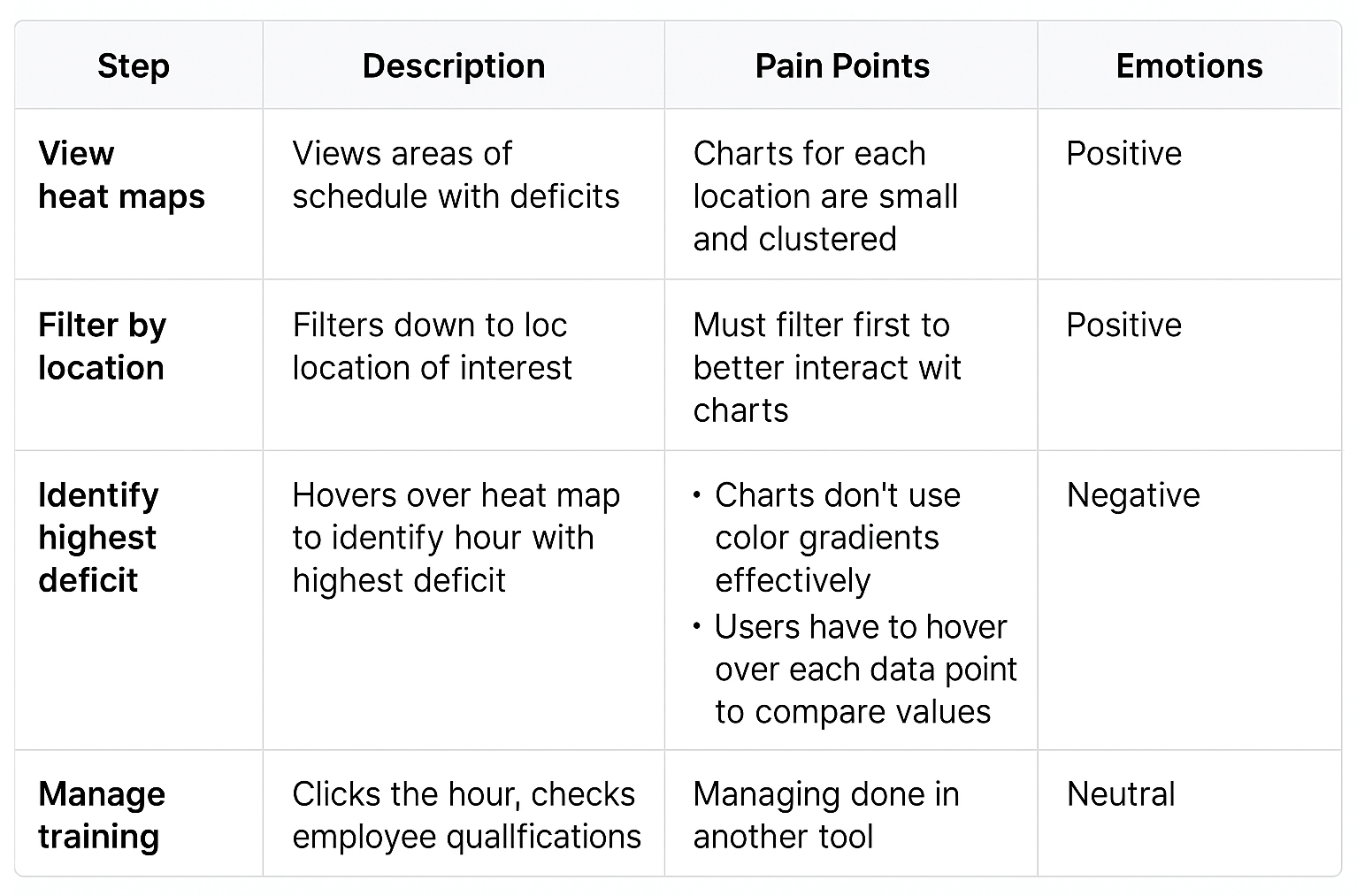
For this project, discovery began with stakeholder interviews and moderated usability tests with airport operation managers. While participants often expressed positive sentiments about the tool, saying it helped them do their jobs, their behavior during testing told a different story. Many struggled to locate key information, and missed visual cues needed to identify trends or take action. This discrepancy between verbal feedback and observed behavior highlighted hidden usability issues that users had adapted to over time without recognizing as pain points. Key insights included difficulty comparing values due to poor visualization, a lack of prioritization, and inefficient workflows that slowed down response time. These findings emphasized the importance of going beyond surface-level feedback and observing users in context to uncover friction points they may not articulate on their own.
Problem Statement
Airport operations managers need a more efficient way to monitor and act on qualification data. Although users reported satisfaction, usability testing revealed issues with data comparison, trend scanning, and prioritization. The current tools do not effectively support key workflows or decision-making needs.
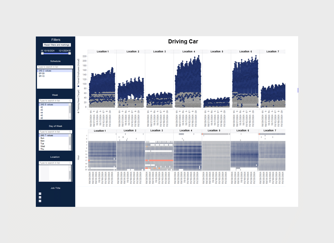
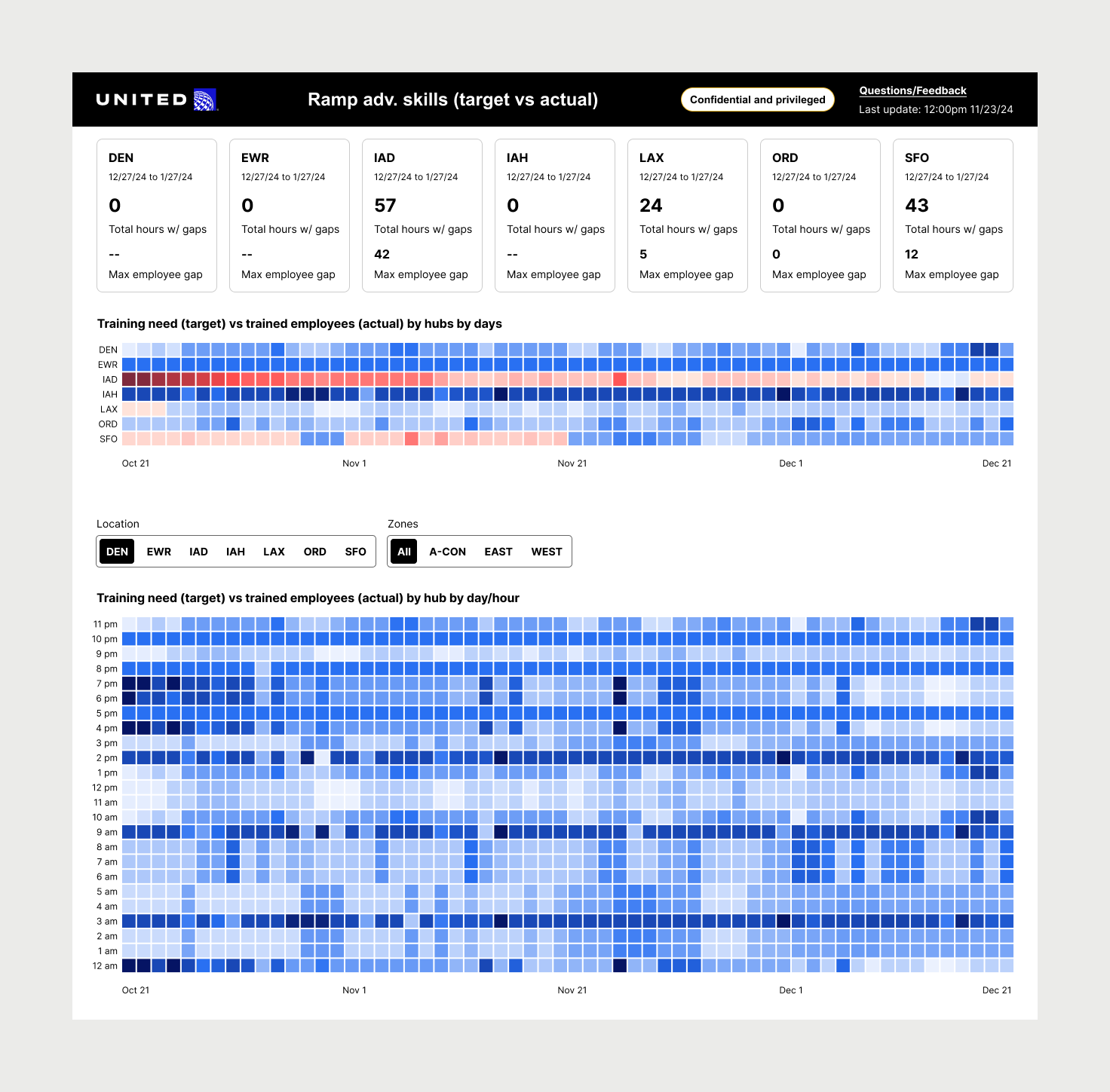
(fig. 1) Original dashboard design
(fig. 2) Summary of problem space
Challenge
"The actual and target numbers aren’t immediately clear, I often have to jump between multiple charts just to figure out if we’re hitting our goals, and that takes more time than it should."
✦ How might we make the complex data charts easier to read and understand?
Solutions
Improve the chart layout to improve readability
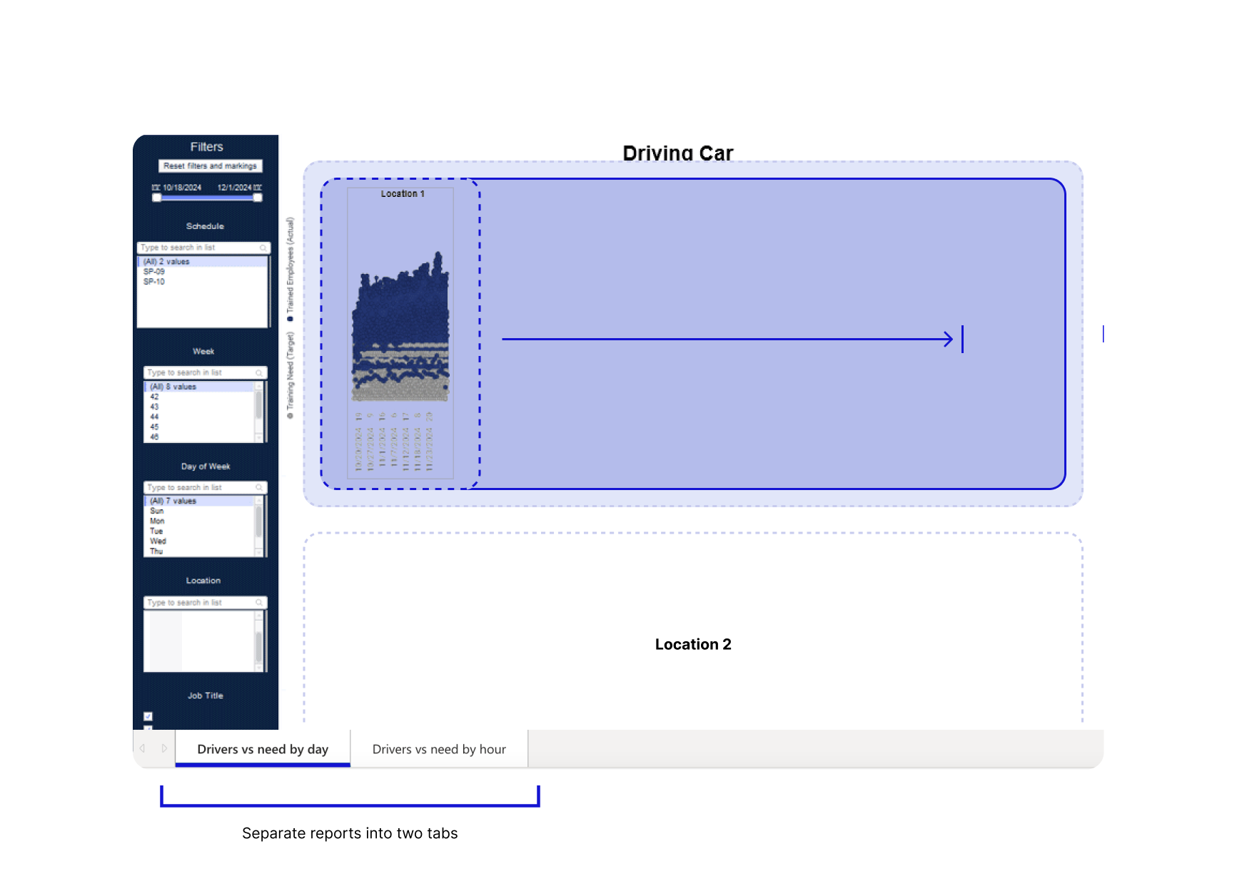
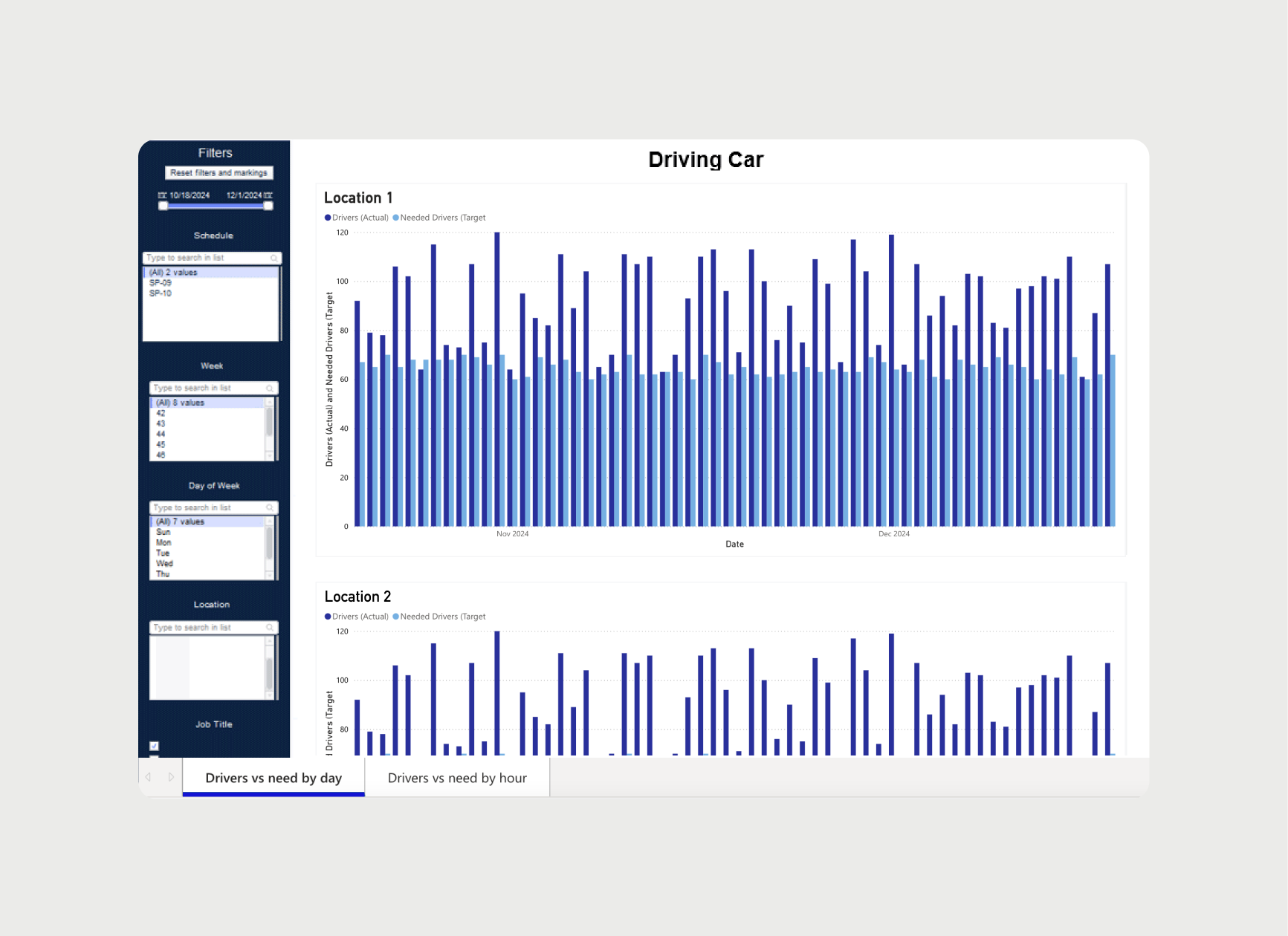
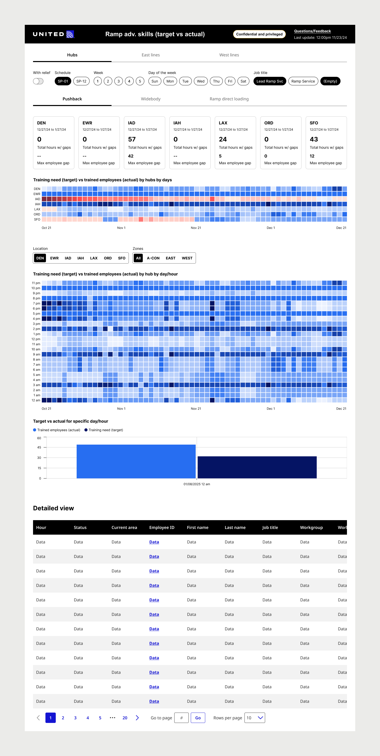
My recommendation is to shift the layout from horizontal to vertical, allowing each chart, organized by location, to use the full screen width beside the filter menu. The expanded space would reduce clutter, improve readability, and enhance usability. For the initial iterations of the design, we separated the two reports into individual tabs using PowerBI's built-in navigation tabs, however we would later change this based on research insights.
Change the chart type, and designs to improve usability
Based on the nature of this report, which involves comparing two distinct variables, a clustered bar chart is more appropriate and effective than a scatterplot. Scatterplots are typically used to explore relationships or correlations between two variables. A bar chart allows for quick identification of shortfalls or surpluses, improving decision-making. Bar charts also scale well with varying data and time ranges, enhancing readability and interaction.
Redesign the heat map to improve usability. The current version is overcrowded and difficult to interpret. A well-designed heat map can use color gradients (blue for surpluses, red for deficits) to show the availability of trained drivers by hour. This would make it easier to spot gaps and surpluses and identify peak demand times. The data points should be clearly spaced in a grid for better readability and interaction, enabling users to filter by date or view granular data. This change would create a more intuitive, actionable tool for staffing decisions.

Challenge
"As someone who uses several different dashboards every day, I’m constantly switching contexts. Each tool has a different levels of detail, which makes it hard to know where to focus first or what the data is trying to tell me."
✦ How might we establish a consistent UX architecture across a diverse set of analytics tools?
Solution
Analytics UX Architectural Framework
To address inconsistencies across United Airlines' suite of HR analytics tools, we created a foundational UX framework that grouped tools into three categories, high-level overviews, deep-dive metric explorers, and operational dashboards, and established UX patterns tailored to each type.
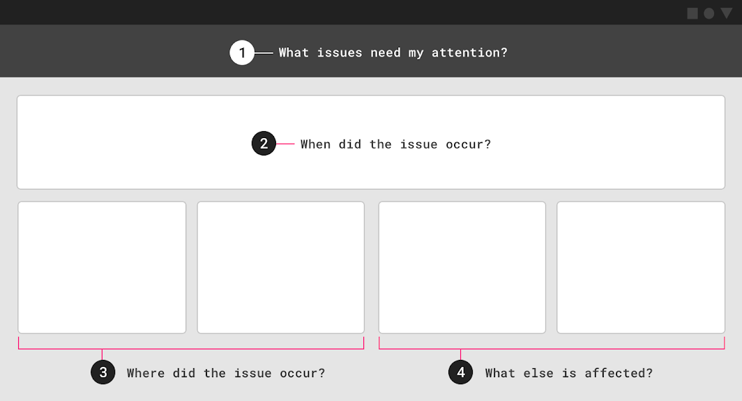
For operational tools like the Airport Operations Advance Skills Scheduling Tool, we defined clear layout principles that emphasized data hierarchy based on users' common questions:
1. What issues need my attention?
2. When did they happen?
3. Where did they happen?
4. What is impacted and what can be done?
This framework helped ensure that information was prioritized using visual hierarchy, so users could scan top-down and quickly interpret and act on the data.
Challenge
“As an Airport Operations Supervisor, I’m responsible for making sure each airport has coverage for key operational roles every day. Right now, I have to scan through a bunch of colors and charts just to figure out where the real problems are. It’s too easy to miss something important.”
✦ How might we help users quickly identify, prioritize, and resolve training coverage gaps across locations and timeframes?
Solution
Redesigning the Tool for Operational Workflow
Through user research, we discovered that the Airport Operations Training Tool was being used not just to view training status, but as a workflow to actively identify and resolve coverage gaps across locations. However, the existing tool offered no clear way to quantify or prioritize which gaps were most urgent, users were left to interpret visual cues to prioritize.
To support this workflow, we redesigned the tool with new features that made it easier to identify and act on problem areas:
– KPI scorecards at the top of the screen summarized the number of training gaps over the next 60 days for each location, giving users a quantifiable, top-level view of which locations needed attention first.
– We replaced multiple line charts with a consolidated heatmap showing training surpluses and deficits, making it easier to pinpoint problematic days at a glance.
– Segmented hourly heatmaps and location-based navigation allowed users to drill down into specific days and hours at a location to begin resolving issues quickly.
✅ User Value: This redesigned workflow helps users move faster and with more confidence, reducing cognitive load, prioritizing the right data, and allowing them to take immediate action on the most critical coverage gaps.
Goals
We conducted moderated user testing and gathered feedback through surveys, internal monitoring tools to evaluate and compare the performance of the current reporting dashboard with the new design after production implementation, with real data.
-20%
reduction in time spent on decision-making tasks
reduction in time spent on decision-making tasks
+15%
improvement in user satisfaction with the tool
improvement in user satisfaction with the tool
Outcomes
-27%
reduction in time spent on decision-making tasks (Utilization monitoring, usability testing)
reduction in time spent on decision-making tasks (Utilization monitoring, usability testing)
+16%
improvement in user satisfaction with the tool (Survey, NPS)
improvement in user satisfaction with the tool (Survey, NPS)