
Unified Cost Estimation Search & Compare
A cross-channel cost transparency experience designed to meet regulatory requirements while improving usability for both members and support teams. The project unified web and phone support tools to deliver a consistent, intuitive way for users to search, estimate, and compare healthcare costs.
Platforms
Mobile Web, Desktop Web
Mobile Web, Desktop Web
Scope
Research, Interaction Design
Research, Interaction Design
Tools Used
Figma
Figma

Problem Statement
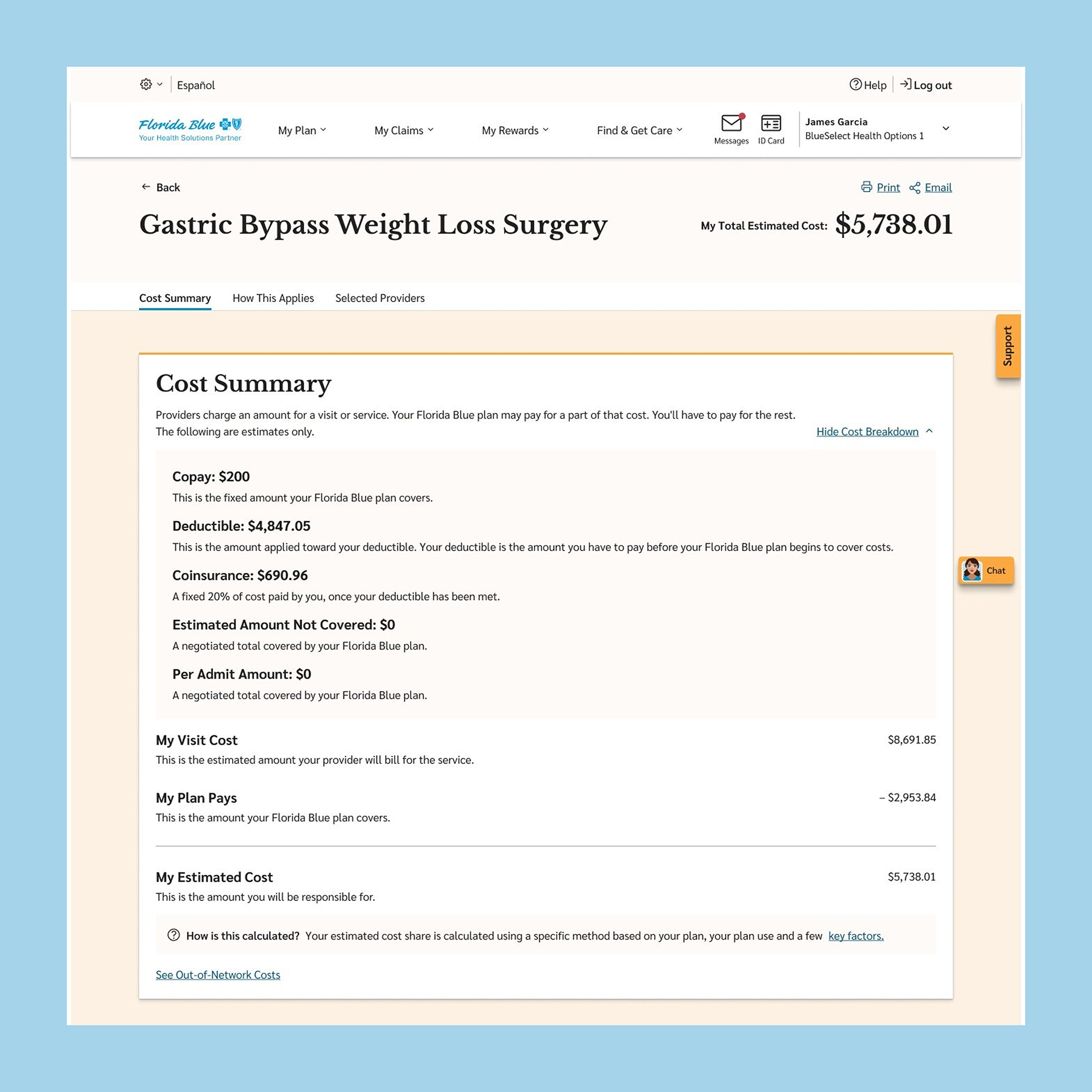
Florida Blue needed to comply with new cost transparency regulations, requiring a solution that allowed members to access cost estimates for medical procedures. However, the existing cost estimator was outdated, difficult to use, and technically limited—posing a risk to both user satisfaction and long-term maintainability. Our challenge was to design a compliant, scalable experience that was intuitive for members and efficient for support teams to use.
Project Challenges
One of the initial hurdles was aligning with business stakeholders, who prioritized speed and cost-efficiency due to the regulatory nature of the project. The plan was to retrofit the current experience. However, both the UX and development teams pushed back, presenting evidence from early usability testing and technical analysis. A small proof of concept and usability test shifted stakeholder support toward building a more robust solution. Later, the design team also faced internal challenges aligning on the best user flow for comparing multiple estimates.
Discovery
Our large cross-functional UX team collaborated across both the external member website and the internal application used by customer support to create a seamless and consistent cost transparency experience for members. The team began with early research and testing, uncovering significant usability flaws in the existing cost estimator tools. To gain a deeper understanding, we interviewed customer service representatives and conducted usability tests with members to identify common pain points, search behaviors, and the language members used when looking for cost estimates.
Challenge
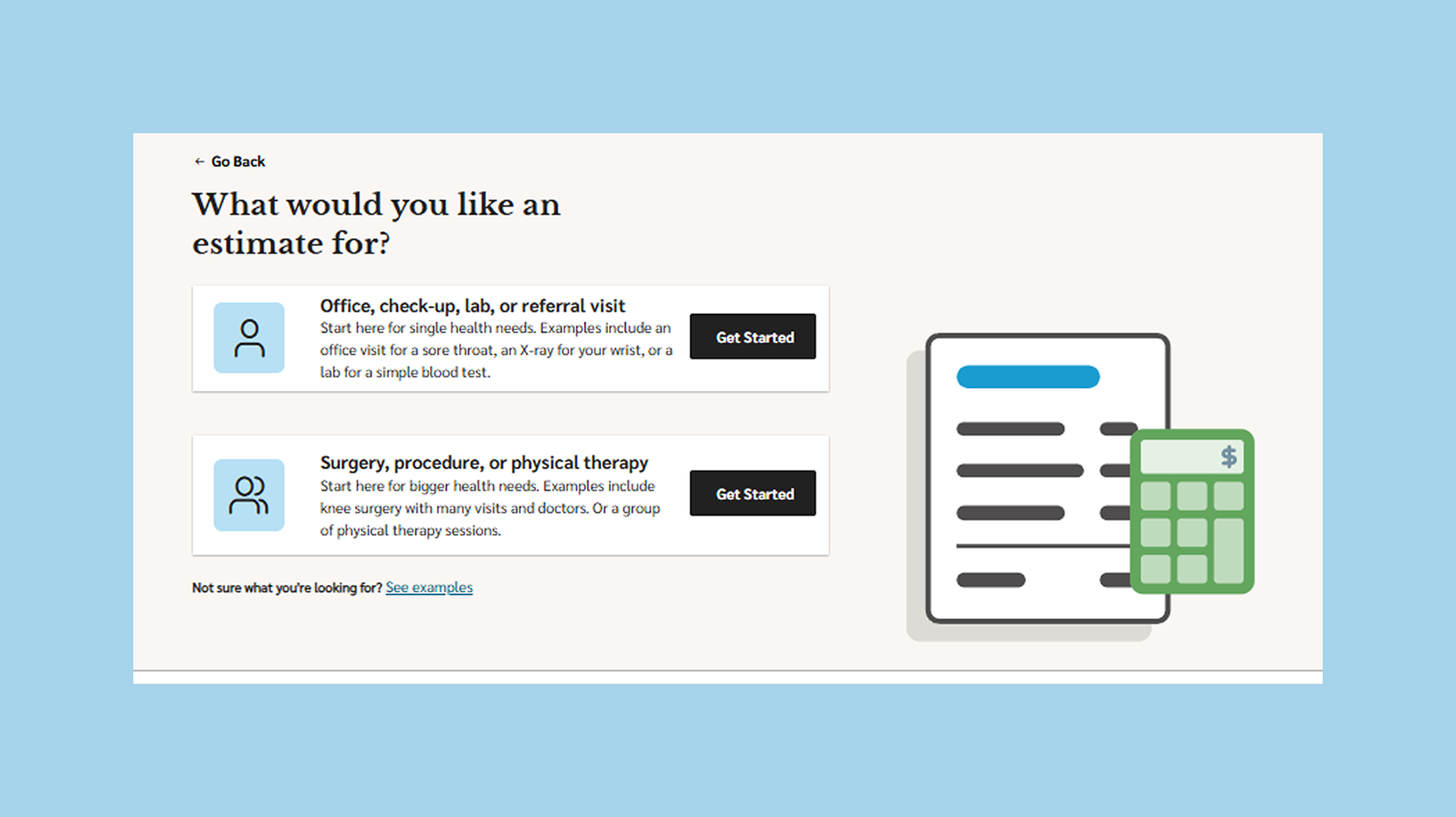
Members often didn’t begin their search by looking for a specific provider, they typically already had a procedure scheduled and wanted to compare costs across providers. The original design assumed users always started with a provider.
✦ How might we allow users to begin their search from either a procedure or a provider so that it better aligns with their real-world intent?
Solution
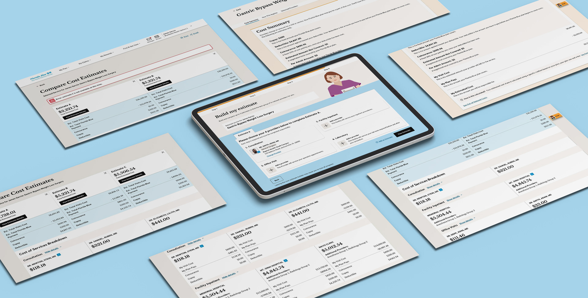
Flexible Search Starting Point
We designed a flexible entry point in the search experience, allowing users to start their journey by selecting either a provider or a procedure, and simple or complex procedures. We presented these options step-by-step using natural, non-technical language to help users select what they were looking for. The search criteria fields would adapt accordingly based on their selection. This reduced friction and made the experience more intuitive regardless of their starting point.
Challenge
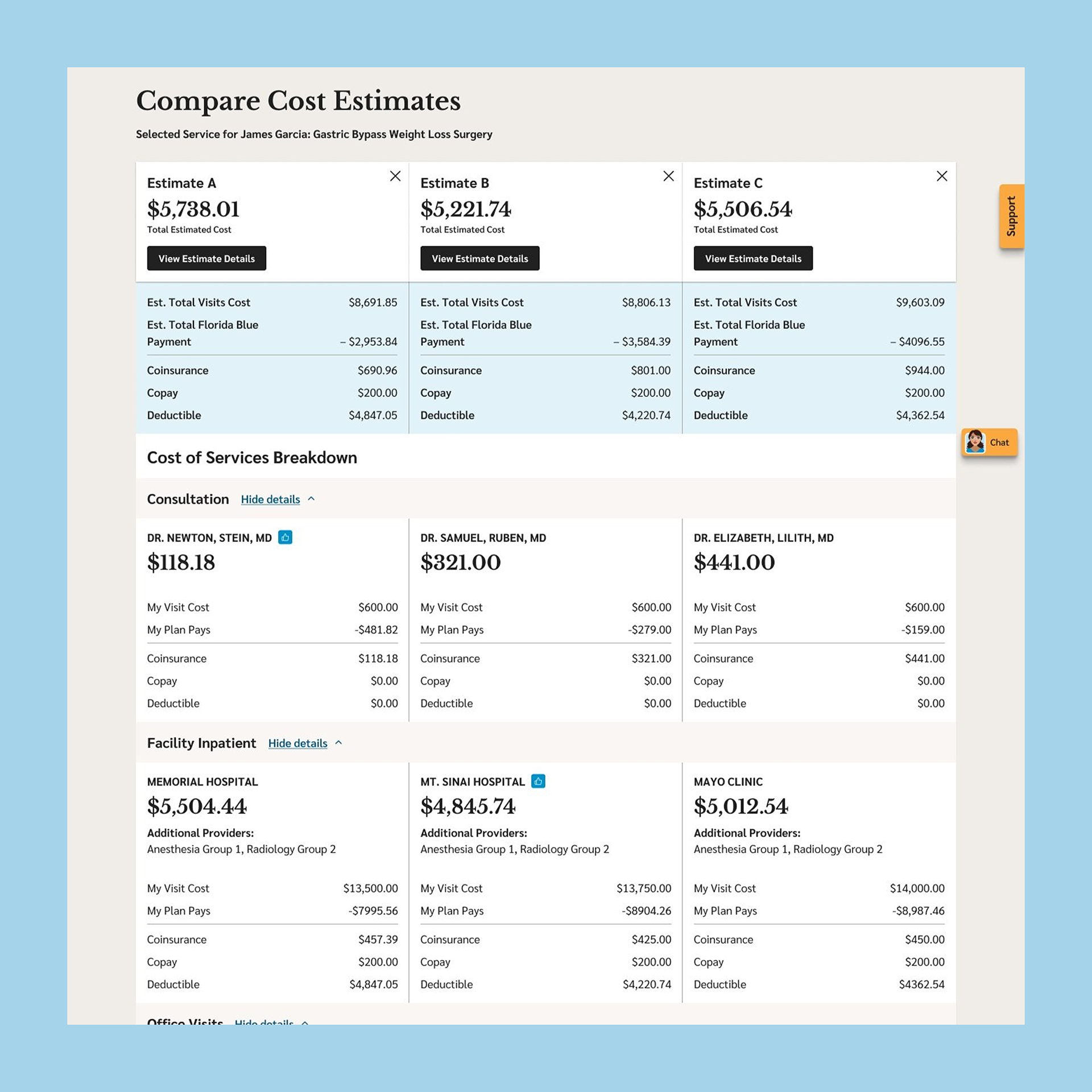
Support reps shared that comparing multiple cost estimates over the phone was time-consuming and hard to communicate clearly. The website also lacked an effective way for members to build and compare multiple estimates.
✦ How might we simplify the process of building and comparing cost estimates for both members and support teams?
Design Debate
While designing the comparison flow, our team faced internal debate around how to structure the experience for building multiple estimates. Some team members leaned toward showing the full comparison flow up front, while I advocated for a progressive approach, allowing users to complete their first estimate before prompting them to add more. I felt this rewarded progress and reduced cognitive overload, especially since many members were just looking for a single cost estimate to start. My perspective was also influenced by familiar e-commerce behaviors, where users compare options after viewing one in detail. Ultimately, we aligned by offering both paths—users could either add comparisons up front or progressively, catering to different user needs and decision-making styles.
Solution
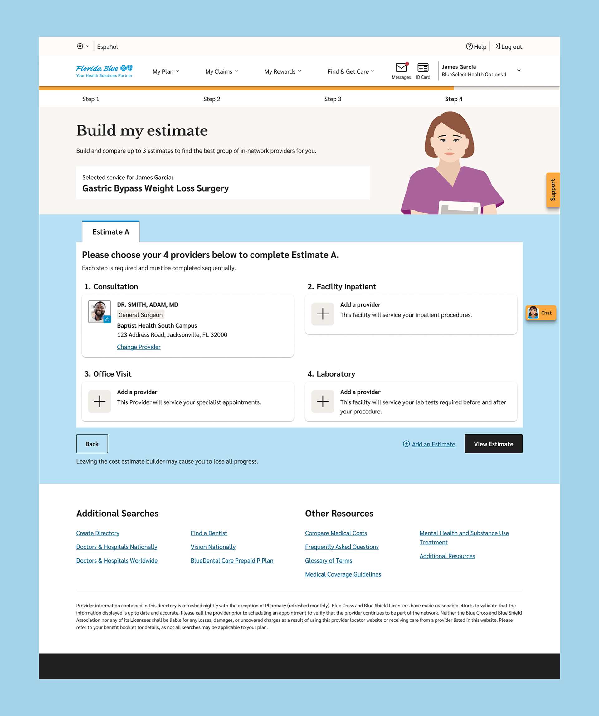
Progressive Estimate Comparison Flow
For comparison, we created a two-tiered flow that allowed users to either build up to three estimates at once or, using a "carrot-first" approach, to build a see the first estimate immediately, reducing cognitive load and encouraging users to complete the first step before committing to more. Additionally, we enabled support reps to send a PDF summary of the cost estimates directly to members, easing communication over the phone and reinforcing consistency across channels.
Challenge
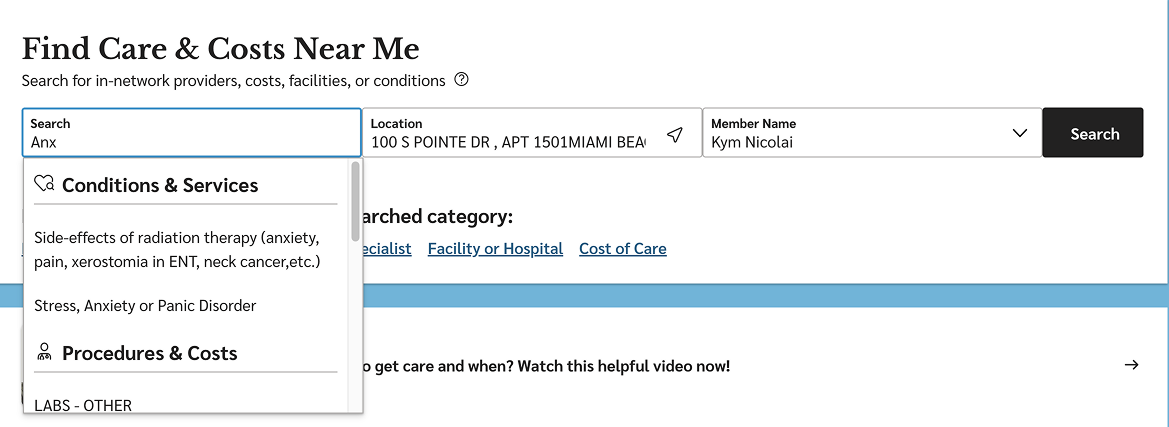
Many members calling in didn’t know the official name of the procedure they needed an estimate for...they only had a description or symptoms.
✦ How might we help members find the right procedure even when they don’t know its name?
Solution
Smart Search for Everyday Language
We implemented a smart search feature capable of recognizing procedure names, plain-language descriptions, and even procedure codes. This enabled members to search using the language they were comfortable with, reducing frustration and supporting more accurate results.
Goals
We collaborated with researchers and product stakeholders to define two core usability goals based on common pain points observed in early testing of the legacy experience. These goals were validated through moderated usability tests and task completion tracking with both members and internal support team simulations.
-20%
Reduce the time it takes for members to generate their first cost estimate.
Reduce the time it takes for members to generate their first cost estimate.
+20%
Improve the number of users who successfully complete a multi-estimate comparison.
Improve the number of users who successfully complete a multi-estimate comparison.
Outcomes
-35%
Reduction in time to first estimate compared to the original experience. (Usability testing)
Reduction in time to first estimate compared to the original experience. (Usability testing)
+32%
Increase in number of users completed at least one comparison during testing. (Usability testing)
Increase in number of users completed at least one comparison during testing. (Usability testing)