
Exact vs Fuzzy Search
When users searched for products on homedepot.com, they were often met with a confusing blend of exact and fuzzy matches, leaving them unsure which results were most relevant. As a UX Designer, I led a design initiative to bring clarity and confidence to this core shopping experience.
Client
The Home Depot
The Home Depot
Platforms
Mobile Web, Desktop Web
Mobile Web, Desktop Web
Scope
Interaction Design, Information Architecture
Interaction Design, Information Architecture
Tools Used
Figma, Mouseflow
Figma, Mouseflow
Discovery
For the discovery phase of the exact vs. fuzzy search results project at The Home Depot, I analyzed hundreds of user feedback comments collected via Mouseflow, each paired with session recordings that showed how users interacted with the site before and after leaving their comments. This qualitative research revealed recurring frustrations with irrelevant search results. By observing real user behavior, I identified patterns such as abandoned searches, repetitive refinements, and confusion over missing results, insights that directly informed key design hypotheses and led to more intelligent, user-centered improvements in search result relevance and recovery experiences.
Problem Statement
Customers using The Home Depot’s search functionality often experience frustration due to irrelevant results or "no results" outcomes, particularly when users had only a general idea of what they were looking for. The current search experience lacks intelligent handling of fuzzy matches and fails to guide users toward relevant alternatives, leading to confusion, repeated searches, and site abandonment.
Competitive Analysis
As part of the discovery process, I used Baymard Institute to conducted a heuristic evaluation and competitive analysis of major retail sites including Lowe’s, Target, Amazon, and Wayfair to assess how each platform handled search relevance, and error tolerance. I evaluated their search experiences against usability heuristics such as error prevention, user control, and recognition over recall, while also noting how they managed fuzzy matches, and search suggestions. This analysis helped identify best practices, like proactive spelling corrections, clear pathways to refine searches, and contextual product recommendations, that informed design opportunities for improving The Home Depot’s own search experience.
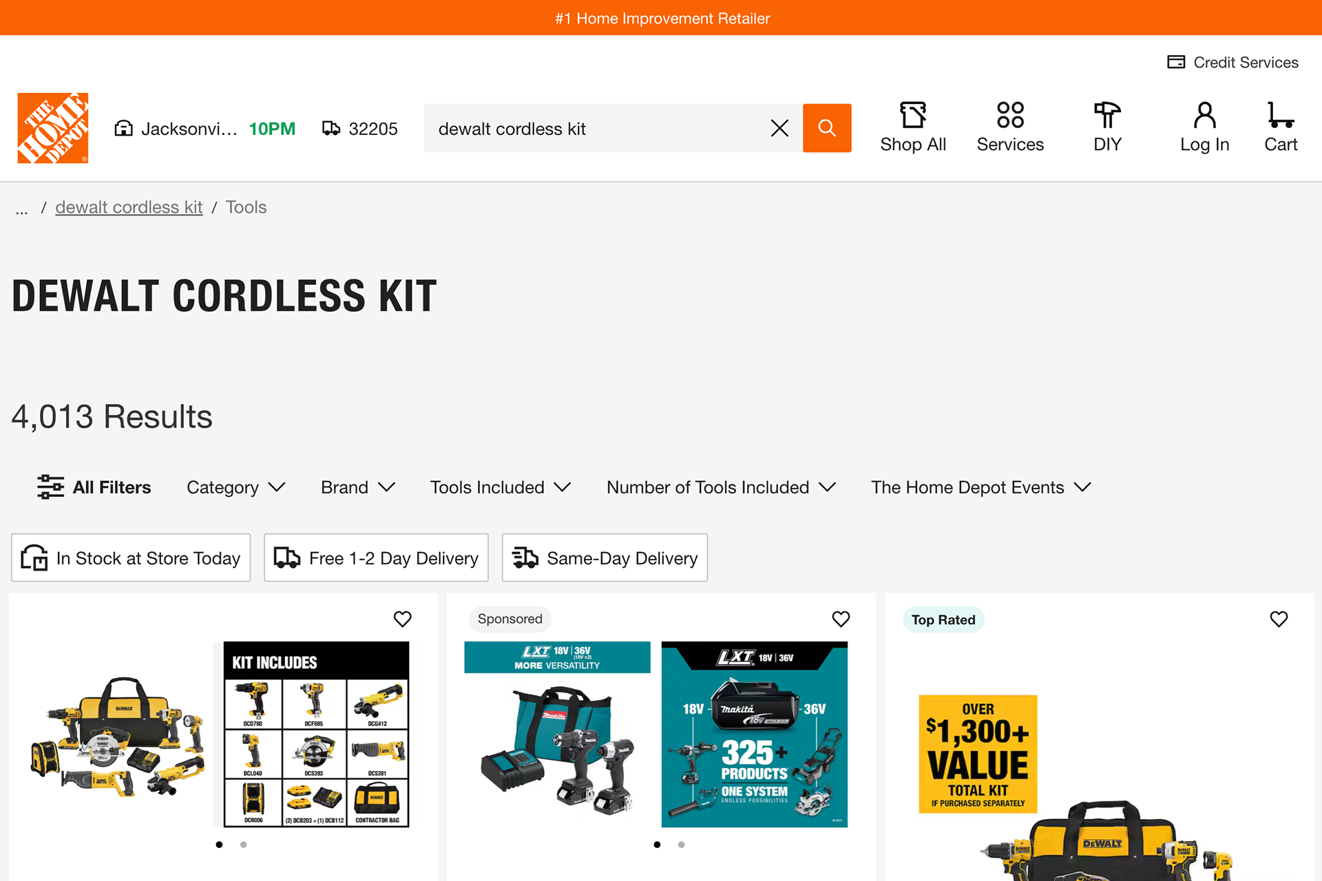
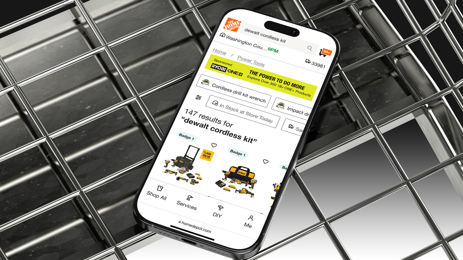
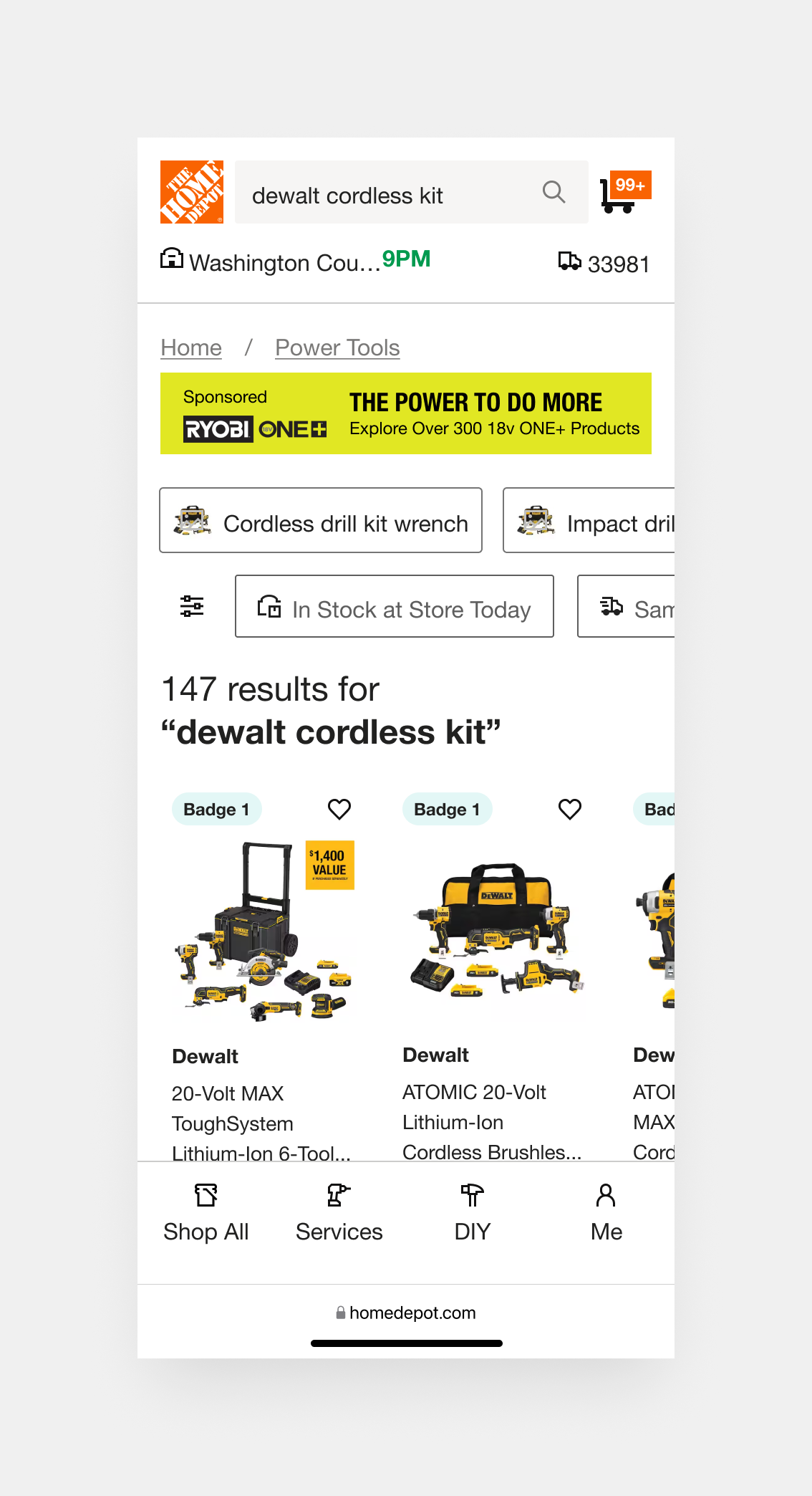
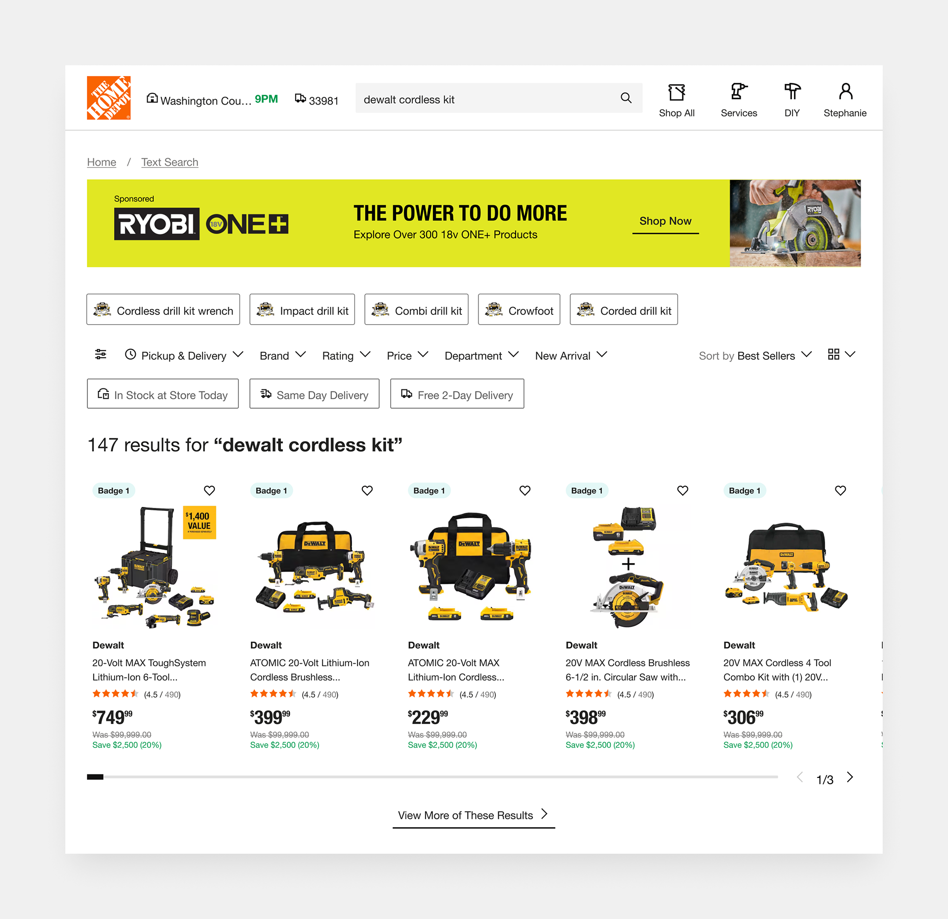
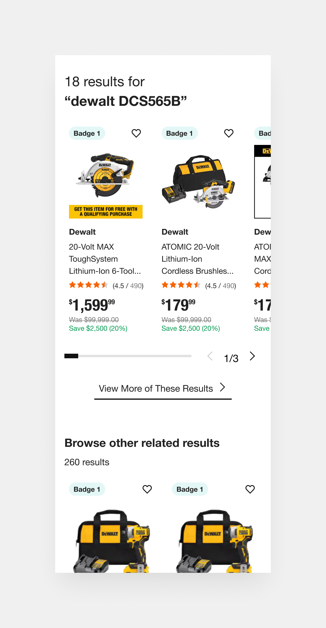
(fig. 1) Current Home Depot product list page
Challenge
“I know I want a Dewalt cordless saw, but I’m not sure what it’s officially called or how to describe it exactly. I just want to type something general and still find the right tool.”
✦ How might we help users find exactly what they’re looking for, even when their search term is broad or vague?
Solution
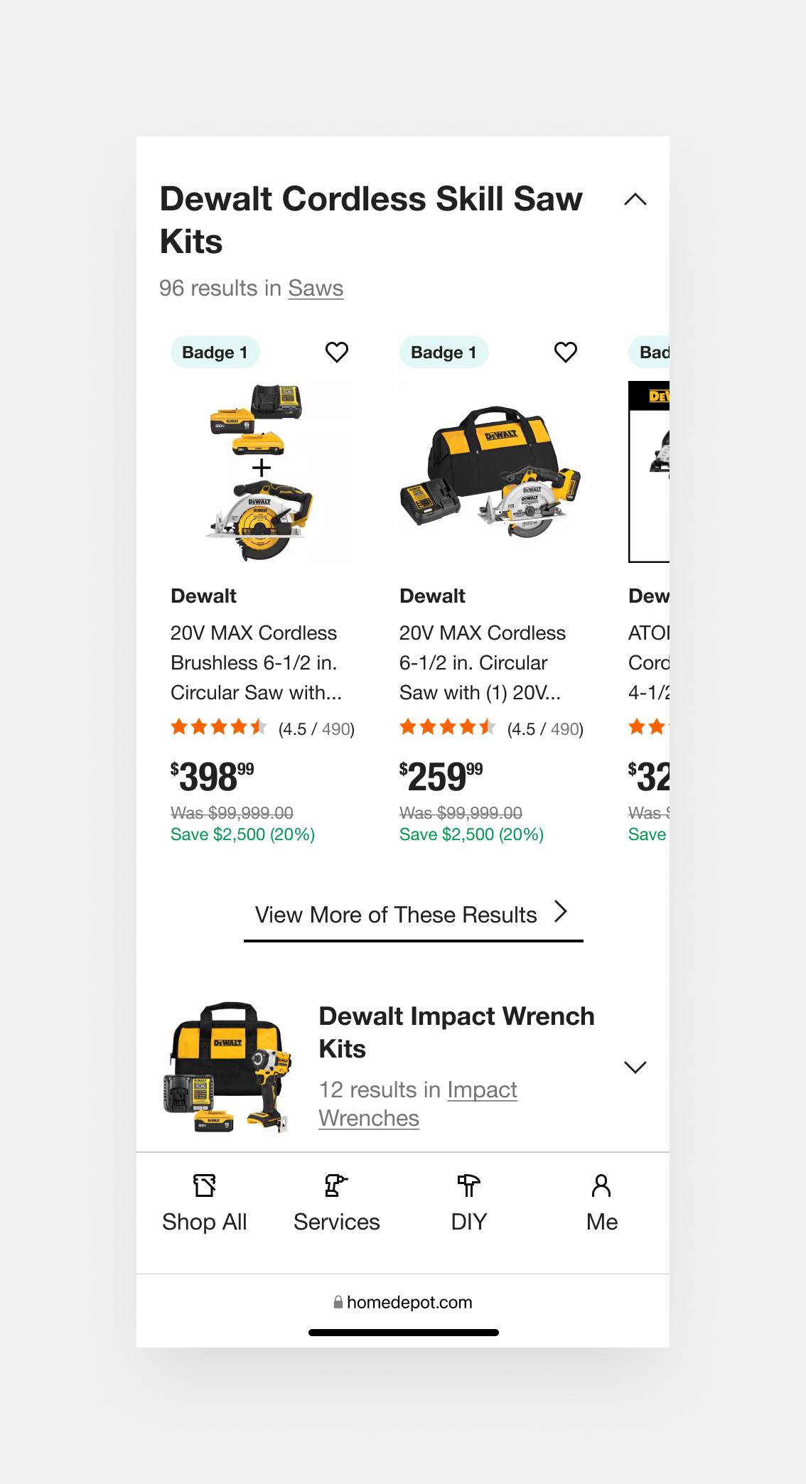
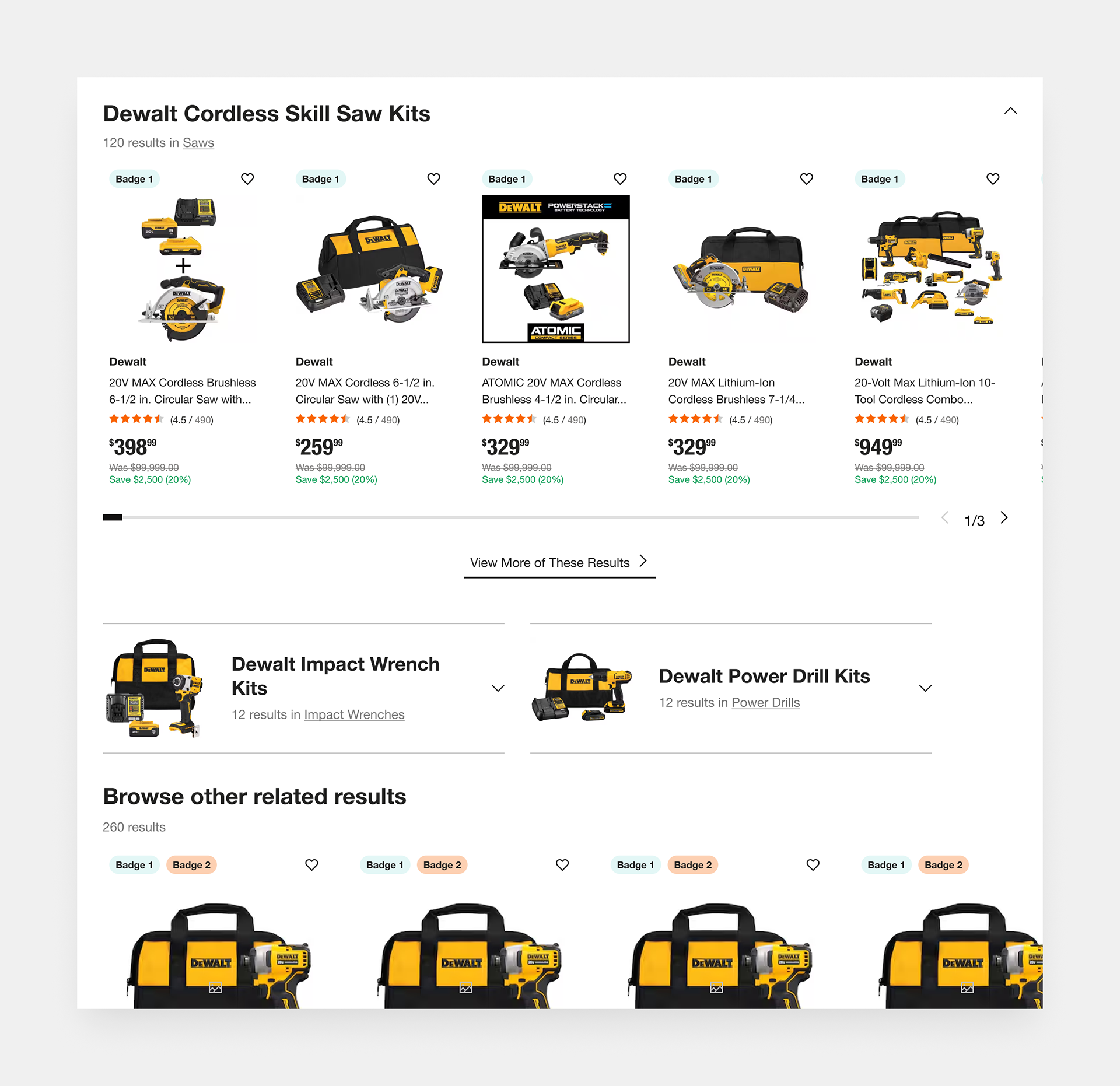
Prioritize Exact Matches to Reinforce Search Confidence
The design intelligently breaks down the search results into clearly labeled sections, starting with exact keyword matches. This prioritization helps users quickly assess whether their vague or broad search yielded a direct hit. If not, the categorized previews offer alternate routes based on product type, narrowing the search space without overwhelming the user.
Challenge
“I searched something pretty general, and now I’m seeing a ton of stuff. I wish there was an easy way to narrow things down without starting over.”
✦ How might we guide users through a broad search experience without overwhelming them?
Solution
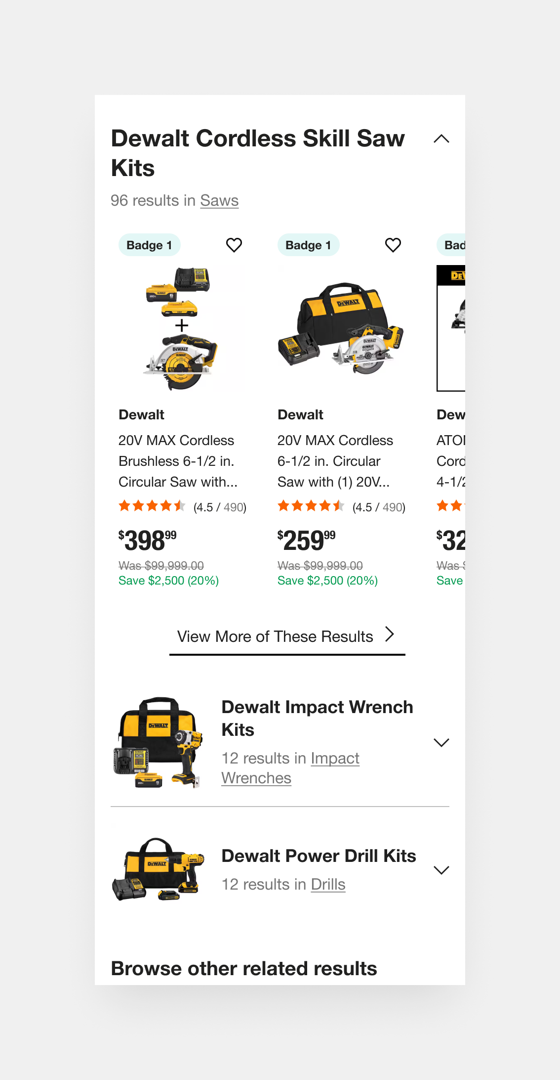
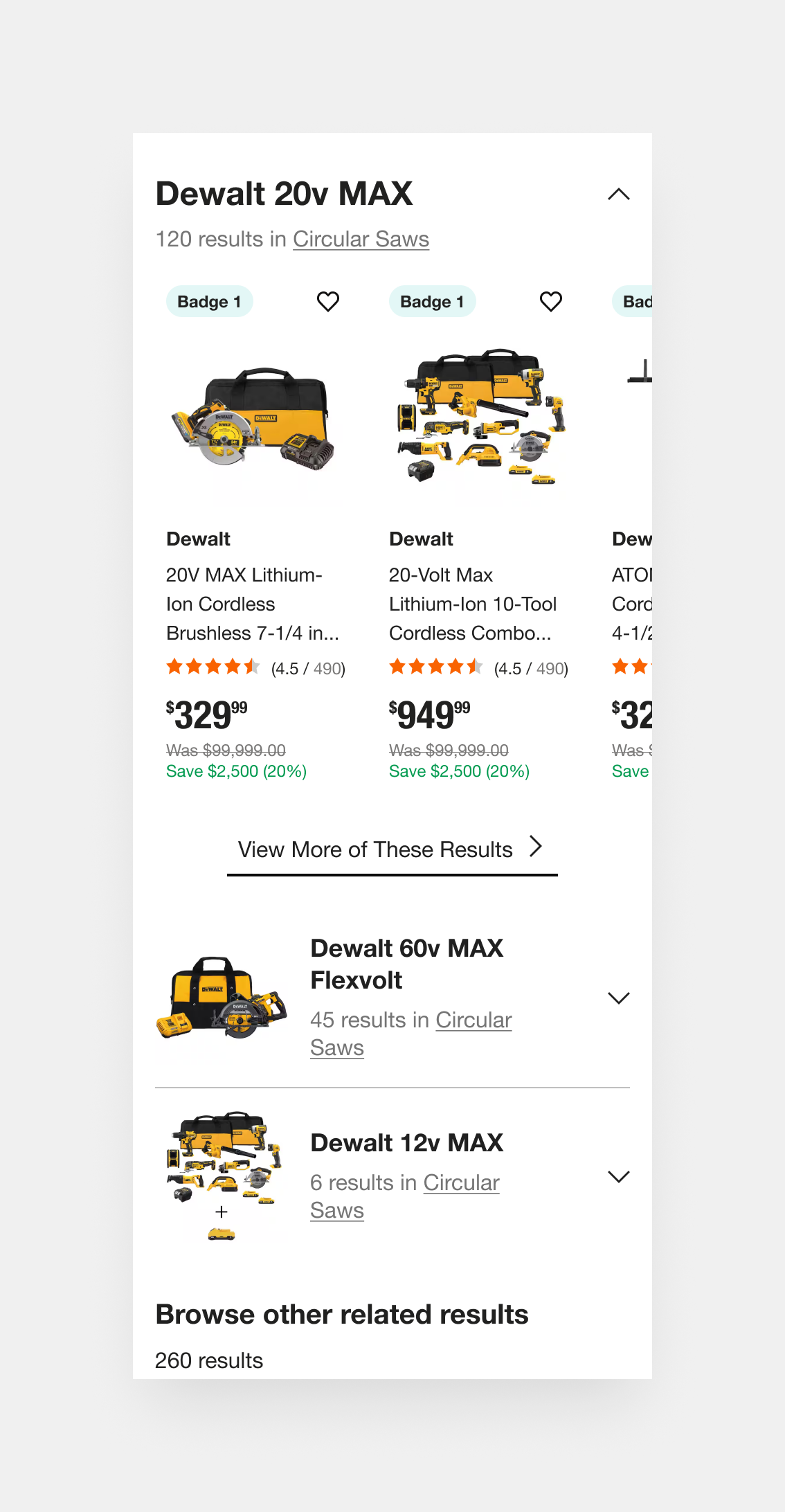
Organize "Fuzzy" Results into Clear, Clickable Categories
By chunking the page into scannable, clearly separated sections, with visual consistency and smart headings, the design avoids the classic “endless scroll fatigue.” Users are guided progressively through increasingly broader options, allowing them to stay oriented and make decisions at each step without needing to backtrack or refine their search immediately.
Challenge
“I’m not sure which exact product I need, but I want to see related options that make sense together, like kits with similar tools or matching battery platforms, so I can compare and decide.”
✦ How might we surface relevant products to support different user intentions?
Solution
Show Preview Sections to Let Users Self-Select Their Intent
Dynamic categories, such as “Cordless Skill Saw Kits” or “Impact Wrench Kits,” anticipate user needs by organizing fuzzy results around product intent and use case. This surfacing of curated subsets encourages exploration, especially when exact matches fall short, and supports different buying paths (e.g., someone who doesn’t know the exact name of the tool but knows the job they need it for).
These dynamic categories, change on search intent. Example: Narrower searches may feature categories based on filters, whereas very specific searches such as model numbers may not feature any categories at all.
These dynamic categories, change on search intent. Example: Narrower searches may feature categories based on filters, whereas very specific searches such as model numbers may not feature any categories at all.
Goals
We will be using recorded user sessions and moderated user tests, using Mouseflow and Lookback, to benchmark the current performance of the product list page and compare it our design solutions before and post-launch.
Although full testing and rollout is still underway, we anticipate:
-15%
decrease in in time users take to complete their search intent.
decrease in in time users take to complete their search intent.
-10%
bounce rate on high-volume keywords
bounce rate on high-volume keywords
+10%
Improvement in avg. task success rate
Improvement in avg. task success rate
Outcomes (so Far)
-15%
decrease in time users take to complete their search intent. (Usability testing)
decrease in time users take to complete their search intent. (Usability testing)
Pending
bounce rate on high-volume keywords
bounce rate on high-volume keywords
+12%
improvement in avg. task success rate (Usability testing)
improvement in avg. task success rate (Usability testing)