

Making it easier to find the right care
A Presbyterian Health Plan member needs to find an in-network provider near them, but broad search results and confusing filters made a basic care search unnecessarily difficult. We redesigned the journey around upfront triage and easier filtering so members could reach a relevant set of providers faster.
Platforms
Mobile Web, Desktop Web, Native Mobile
Mobile Web, Desktop Web, Native Mobile
Scope
Design Lead, Information Architecture, Interaction Design, UI, Research
Design Lead, Information Architecture, Interaction Design, UI, Research
Tools Used
Figma, Qualtrics, LogRocket
Figma, Qualtrics, LogRocket
Context
A Presbyterian Health Plan member needs to find an in-network provider near them.
Most members begin with only a few pieces of information: where they live, what type of care they need, and sometimes their health plan.
The directory serves both authenticated and unauthenticated users, including a large Medicare and Medicaid population.
User Goals
Find a provider that is in-network, close enough to access, and appropriate for the care they need.
Finding a provider was overwhelmingly the primary reason members visited the directory.
83%
came to find a provider
came to find a provider
The problem
The directory made members do the narrowing work themselves.
Members were dropped into broad result sets and expected to navigate numerous filters, categories, and submenus before reaching a manageable set of providers.
Only 26%
provider-search task completion rate
provider-search task completion rate
31%
overall satisfaction rating
overall satisfaction rating
35.2/100
UMUX Lite score (industry usability survey/metric)
UMUX Lite score (industry usability survey/metric)
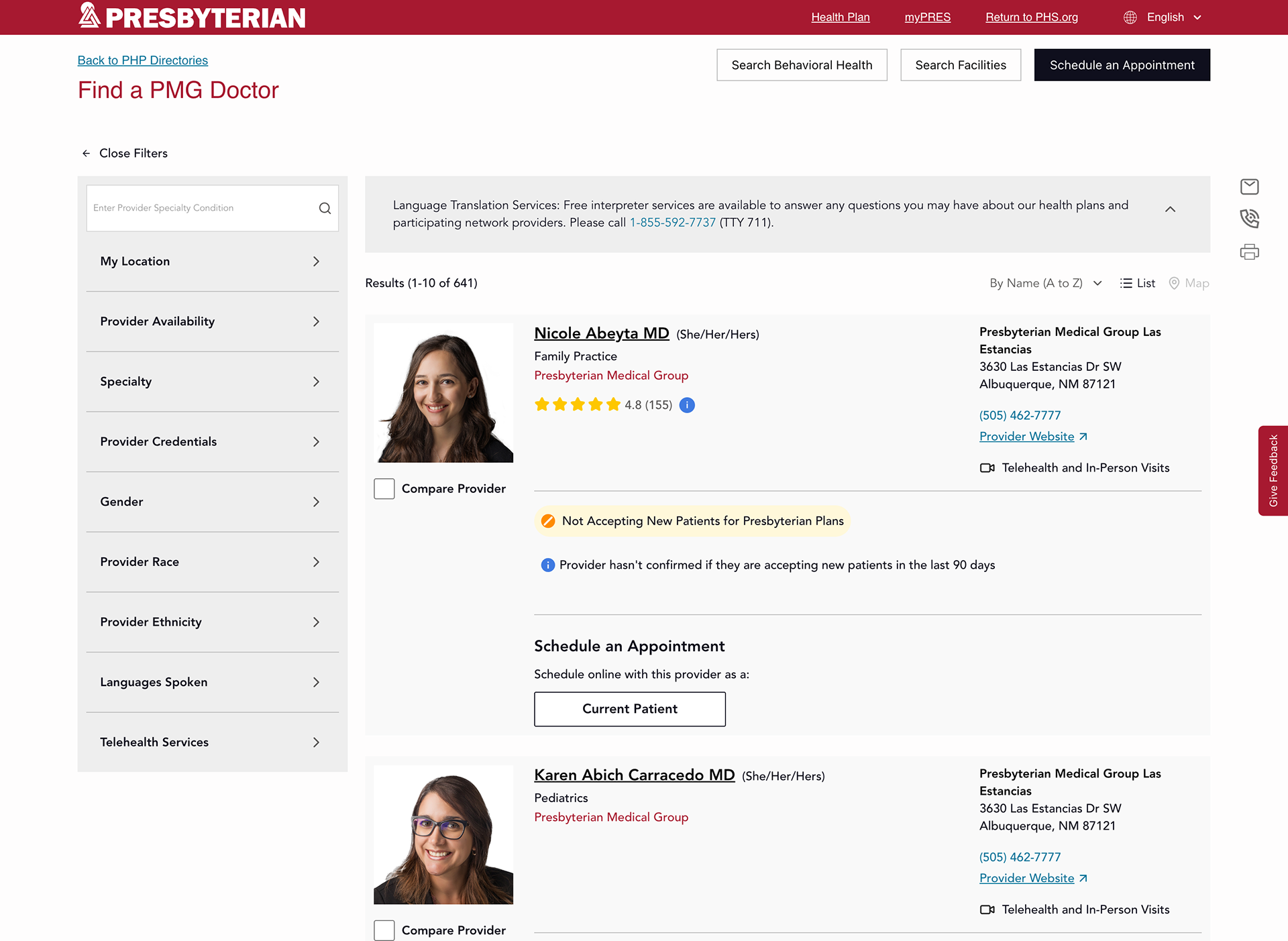
(fig. 1) Legacy PHP provider director
User NEed
“I need a dermatologist near me who takes my plan.”
Why it's challenging
The existing experience sent members directly to a large result set, where they repeatedly applied location, specialty, insurance, and other filters to get somewhere relevant.
✦ How might we use what members already know to get them closer to the right providers before showing results?
Solution
Start With What Members Already Know
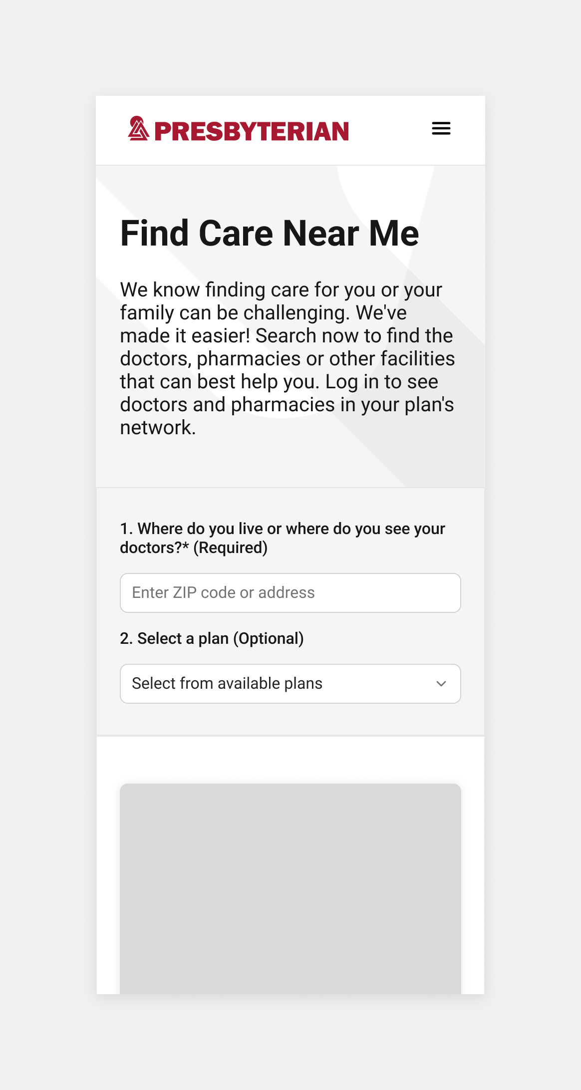
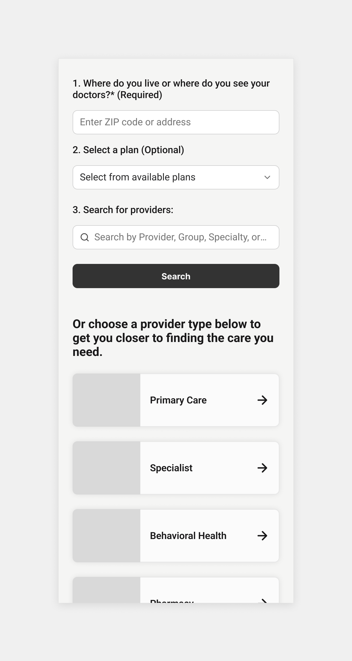
We introduced triage before the results page, asking for the information most likely to shape the search first: location, health plan, and care need. Instead of showing the entire provider network and asking members to correct it afterward, the system narrows the search before they begin evaluating providers, and progressively discloses the fields.
Why not go straight to the result?
Stakeholders initially preferred sending members directly to results because triage added clicks. But behavioral data showed those interactions were already happening later through repeated filter changes and submenu navigation.
We didn’t remove interaction. We moved the right interactions earlier.
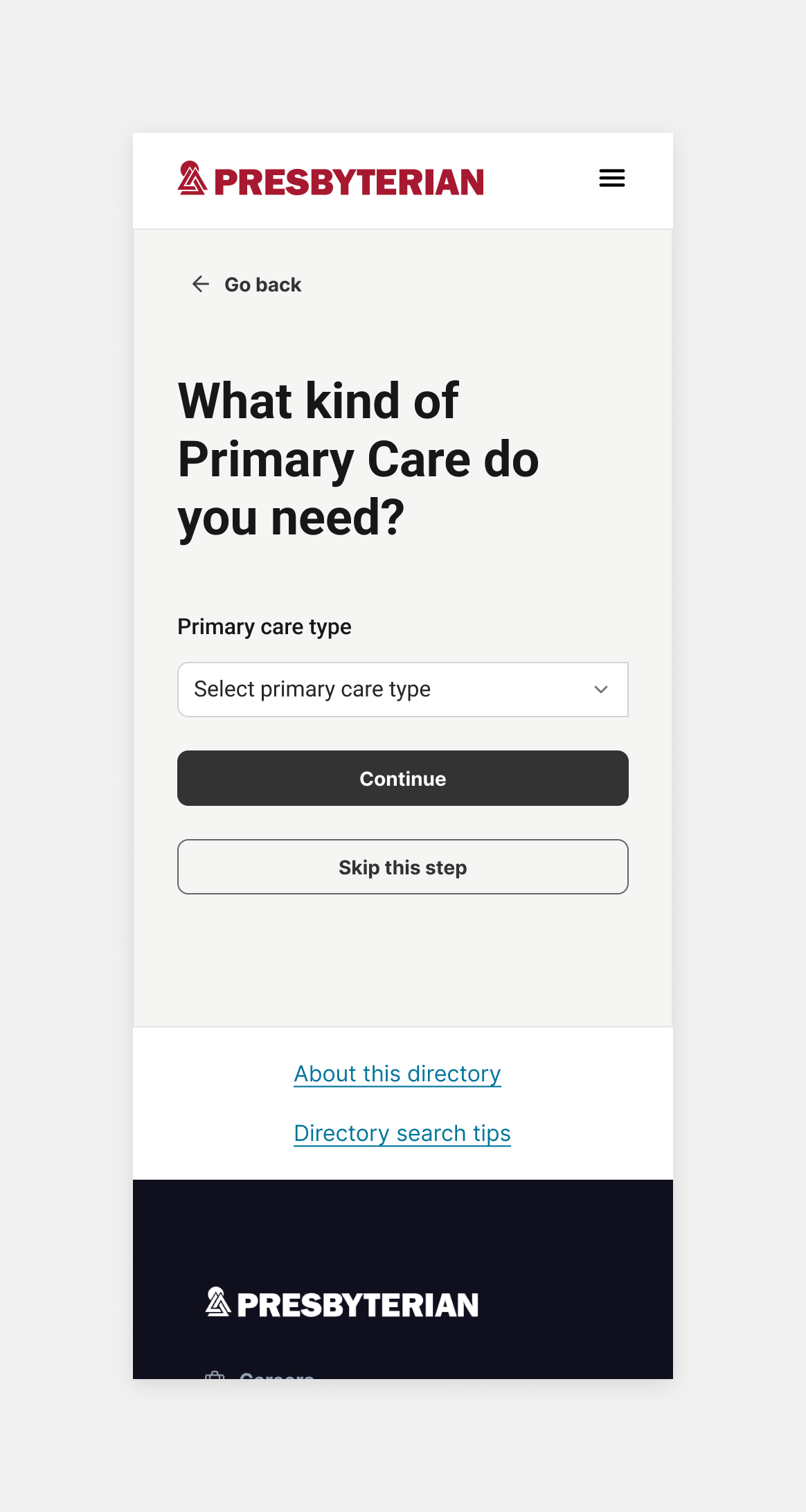
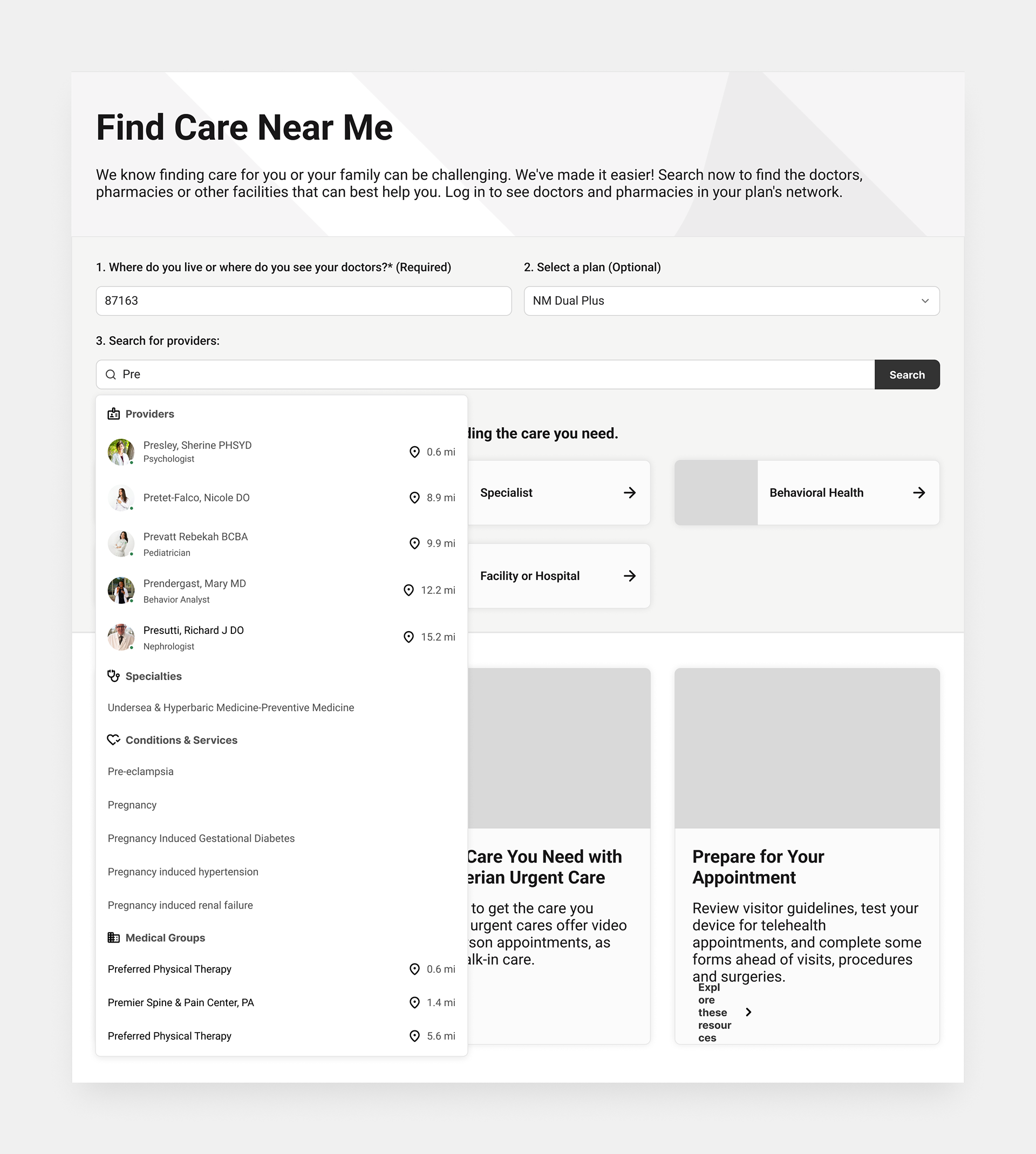
User NEED
"I found providers, but I need to quickly narrow them to the ones that actually work for me."
Why it's challenging
The existing directory treated dozens of filters as equally important. Important criteria were buried in nested menus, and users struggled with filter comprehension and persistence.”
✦ How might we make common refinements immediately available without hiding less common options?
Solution
Prioritize the Filters Members Actually Use
Analytics showed that a relatively small group of filters accounted for much of member behavior. We elevated high-value criteria like specialty, location, distance, insurance, and availability into quick filters, while keeping less common options inside a simplified All Filters experience.
Why this filter model works where others failed
Through rapid testing we proved that improving only the full filter panel would still require members to open a complex control for routine decisions. Quick filters and quick access filter menus reduce navigation for high-frequency needs while preserving access to the full directory taxonomy.


Deep submenus we're obviously wrong for our users. A scrollable panel felt right at first but tested poorly against more naturally grouped accordions.
User need
“I found several providers. Now I need to know which one is actually right for me.”
Why it's challenging
A shorter list doesn’t solve the problem if members still have to open every profile to determine whether a provider fits their needs.
✦ How might we help members evaluate providers before opening every profile?
Solution
Put Decision-Making Information Where the Decision Happens
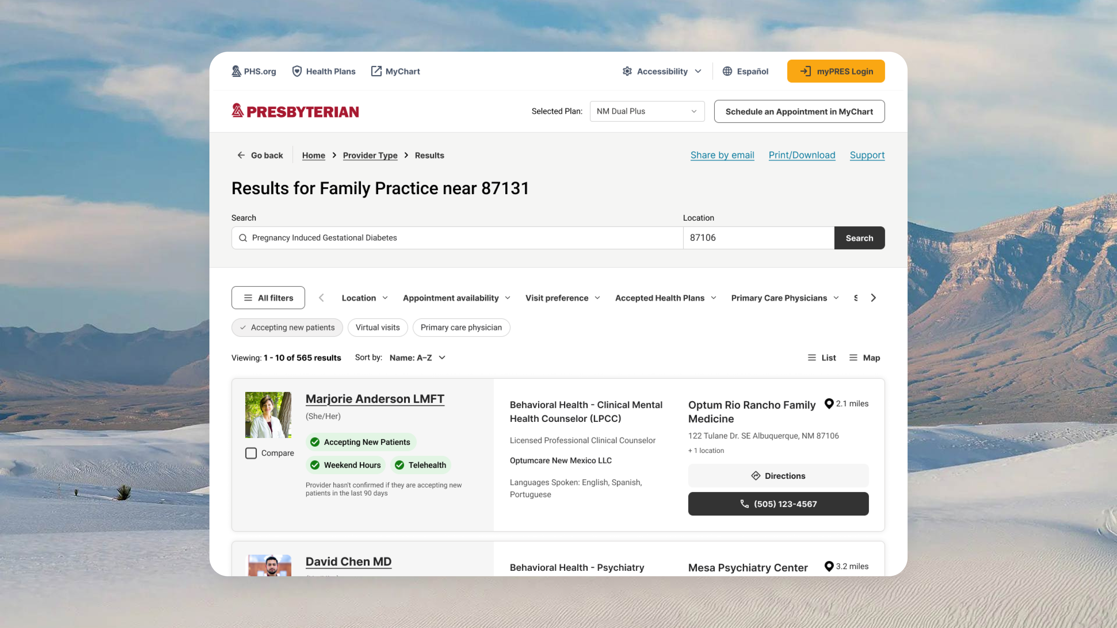
We redesigned results around the information members use to eliminate or select an option, then reserved provider profiles for deeper evaluation.
Why this information hierarchy worked
Showing too little information forced members into repeated profile views. Showing everything made results difficult to scan.
We prioritized the information members needed to make the next decision, not every piece of provider data available.
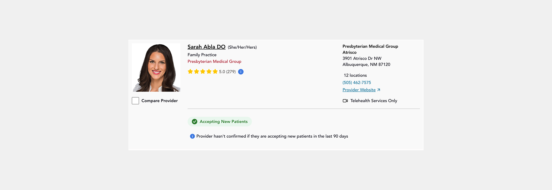
Old provider card
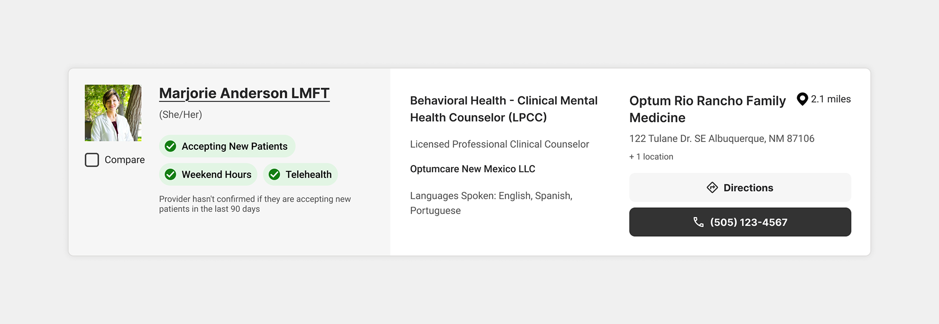
New provider card
goals
75%
task completion rate
task completion rate
60/100
UMUX Lite score (industry benchmark)
UMUX Lite score (industry benchmark)
50%
satisfaction rate
satisfaction rate
Outcomes
The biggest improvement wasn’t a cleaner filter panel. It was redesigning the journey so members no longer had to understand the complexity of the provider network themselves.
The redesigned experience made it significantly easier for members to complete the same provider-search tasks.
We benchmarked the existing directory and redesigned experience using the same survey method and measures. Full launch is still underway, so these results reflect soft launch responses with a subset of members.
78%
task completion rate (soft launch survey)
task completion rate (soft launch survey)
68.8/100
UMUX Lite score (soft launch survey)
UMUX Lite score (soft launch survey)
64%
satisfaction rating (soft launch survey)
satisfaction rating (soft launch survey)


